Latest on MJJC
- Latest Michael Jackson News
- Click Here to Join Our Community
- Follow us on X
- Wanna talk Michael? Come join the chat rooms
- The Michael Jackson Chart Watch
- Become an MJJC Patron
- Join the Premium Member Group and Get Lot's of Extra's
- Major Love Prayer - Worldwide Monthly Prayer Every 25th
- MJJC Exclusive Q&A - We talk to the family and those in and around Michael
- Join us in the Chat Rooms
- Find us on Facebook
You are using an out of date browser. It may not display this or other websites correctly.
You should upgrade or use an alternative browser.
You should upgrade or use an alternative browser.
Xscape General Discussion
- Thread starter Pentum
- Start date
CherubimII
Proud Member
- Joined
- Jul 25, 2011
- Messages
- 6,843
- Points
- 113
http://latimes.com/entertainment/mu...nreleased-recordings-20140331,0,3716910.story
latimes.com
Michael Jackson album 'Xscape' to Feature Unreleased Recordings
By Todd Martens
9:14 AM PDT, March 31, 2014

A new album will once again offer fans a glimpse as to what music lies inside the Michael Jackson vaults. On May 13, Sony's Epic Records will release "Xscape," a collection of eight, previously unreleased Jackson songs.
The album was executive produced by Epic Records Chairman/CEO L.A. Reid, who, according to a Sony press release, curated the album and decided on its final tracklist. A host of recognizable producers worked on the Jackson songs, including the project's lead producer, Timbaland.
The final eight songs were chosen after apparently combing through four decades of material. All the songs on "Xscape" feature completed Jackson vocals, according to the release, but they were retooled. Reid, in the statement, prefers the word "contemporizing," noting that producers did not treat the material as sacrosanct.
“Michael left behind some musical performances that we take great pride in presenting through the vision of music producers that he either worked directly with or expressed strong desire to work with. We are extremely proud and honored to present this music to the world," Reid said in the statement.
Those who prefer to hear the material as Jackson, who died in 2009, left it on the cutting room floor can pay extra for the deluxe edition of "Xscape," which will also include the eight songs in the original form. The albums will be available for preorder starting Tuesday, and a full tracklist has not yet been revealed.
The title track was said to be written by Jackson and producer Rodney Jerkins, who worked with Jackson on his 2001 album "Invincible." "It is," according to the announcement, "the one track on the album that was 'contemporized' by the producer who recorded it originally in the studio with Michael."
Other producers on the album include the Stargate team (Rihanna), Timbaland pal Jerome "J-Roc" Harmon (Beyoncé) and veteran industry executive John McClain. Epic in 2010 released the posthumous Jackson collection "Michael," an album that featured the "Hold My Hand" duet with Akon.
latimes.com
Michael Jackson album 'Xscape' to Feature Unreleased Recordings
By Todd Martens
9:14 AM PDT, March 31, 2014
The album was executive produced by Epic Records Chairman/CEO L.A. Reid, who, according to a Sony press release, curated the album and decided on its final tracklist. A host of recognizable producers worked on the Jackson songs, including the project's lead producer, Timbaland.
The final eight songs were chosen after apparently combing through four decades of material. All the songs on "Xscape" feature completed Jackson vocals, according to the release, but they were retooled. Reid, in the statement, prefers the word "contemporizing," noting that producers did not treat the material as sacrosanct.
“Michael left behind some musical performances that we take great pride in presenting through the vision of music producers that he either worked directly with or expressed strong desire to work with. We are extremely proud and honored to present this music to the world," Reid said in the statement.
Those who prefer to hear the material as Jackson, who died in 2009, left it on the cutting room floor can pay extra for the deluxe edition of "Xscape," which will also include the eight songs in the original form. The albums will be available for preorder starting Tuesday, and a full tracklist has not yet been revealed.
The title track was said to be written by Jackson and producer Rodney Jerkins, who worked with Jackson on his 2001 album "Invincible." "It is," according to the announcement, "the one track on the album that was 'contemporized' by the producer who recorded it originally in the studio with Michael."
Other producers on the album include the Stargate team (Rihanna), Timbaland pal Jerome "J-Roc" Harmon (Beyoncé) and veteran industry executive John McClain. Epic in 2010 released the posthumous Jackson collection "Michael," an album that featured the "Hold My Hand" duet with Akon.
DanGerouS-
2000 Watts $horty
- Joined
- Aug 22, 2013
- Messages
- 1,145
- Points
- 113
Re: News and discussion about new MJ album : Xscape, May 13, 2014.
i hope the songs gonna be rly long.
like 7-8min.
cause, i could listen to MJ adlibing the whole day
Wow this is excellent news!!
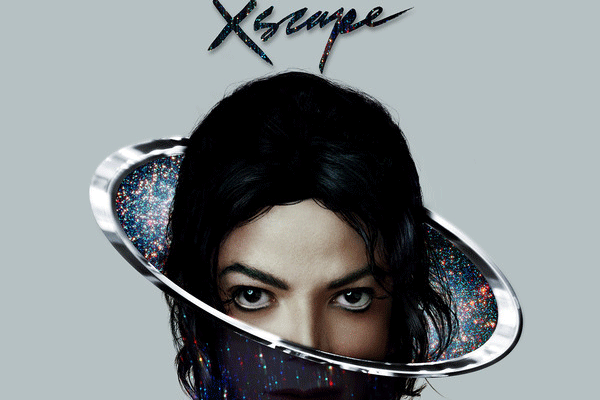
Some fans don't seem to like the cover artwork - I love it!! It just looks like as if Michael would pop out of some kind of glittery curtain (the one magicians use to hide or reveal objects). And the title fits perfectly. I'm soooooo excited!! :chillin:
And as for the 'few' 8 songs.. remember.. Michael's songs tend to be longer than average ones. I think we're looking for quality here, rather than quantity. :wub:
I'm glad they'll put on the raw tracks as well, so there'll be no confusion.
i hope the songs gonna be rly long.
like 7-8min.
cause, i could listen to MJ adlibing the whole day
morinen
Proud Member
- Joined
- Mar 26, 2010
- Messages
- 1,074
- Points
- 48
Re: News and discussion about new MJ album : Xscape, May 13, 2014.
Can anyone tell which photo the cover is shopped from? It seems to be an unreleased photo - I don't remember anything that looks like that. Also in this photo http://www.michaeljackson.com/sites/mjackson/files/slide-art-mj-rn232211-v5.jpg there is something weird on his chest - like traces of inscription or something.
ETA: Or maybe it's his suit partly wiped out so carelessly.
Snow White luvs Peter Pan
Proud Member
Re: News and discussion about new MJ album : Xscape, May 13, 2014.
I don't quite love the artwork but I'm glad the Estate didn't use a picture from the 80's and we're gonna have the demos. Are those 8 tacks the demos?
In the meantime I still prefer the original Xscape song.
I don't quite love the artwork but I'm glad the Estate didn't use a picture from the 80's and we're gonna have the demos. Are those 8 tacks the demos?
In the meantime I still prefer the original Xscape song.
wendijane
Premium Member
- Joined
- Jan 12, 2008
- Messages
- 25,892
- Points
- 113
Re: News and discussion about new MJ album : Xscape, May 13, 2014.

The Estate have done M proud, That's for sure. The artwork reminds me of Saturn. It's Intense Remarkable and BEAUTIFUL It's out of this world.... Michael I wish you could see this Its absolutely Perfect
For me it shows eternity, evermore, gently, artistically .

The Estate have done M proud, That's for sure. The artwork reminds me of Saturn. It's Intense Remarkable and BEAUTIFUL
For me it shows eternity, evermore, gently, artistically .
SoCav
Proud Member
- Joined
- Jul 25, 2005
- Messages
- 1,978
- Points
- 83
Re: News and discussion about new MJ album : Xscape, May 13, 2014.
I think it is likely to be a composite. The bottom half of the face does not even look like MJ that much, if I'm honest (look at the teeth under the upper lip, for instance - very strange). Try covering the upper half (which does of course look like Michael) and see for yourself. It also does not seem to match the upper half, it's as if the upper half is bigger and/or was placed a bit too far to the right.Can anyone tell which photo the cover is shopped from? It seems to be an unreleased photo - I don't remember anything that looks like that. Also in this photo http://www.michaeljackson.com/sites/mjackson/files/slide-art-mj-rn232211-v5.jpg there is something weird on his chest - like traces of inscription or something.
IMWhizzle
Proud Member
- Joined
- Jul 25, 2011
- Messages
- 3,146
- Points
- 63
Re: News and discussion about new MJ album : Xscape, May 13, 2014.
Well, I LOVE the album cover. It suits MJ's artistic flow when it comes to album covers.
I think it is likely to be a composite. The bottom half of the face does not even look like MJ that much, if I'm honest (look at the teeth under the upper lip, for instance - very strange). Try covering the upper half (which does of course look like Michael) and see for yourself. It also does not seem to match the upper half, it's like the upper half was placed a bit too far to the right.
Well, I LOVE the album cover. It suits MJ's artistic flow when it comes to album covers.
moonball29
Proud Member
Re: News and discussion about new MJ album : Xscape, May 13, 2014.
^Maybe it's just a bad angle. His head is looking down a bit.
^Maybe it's just a bad angle. His head is looking down a bit.
Snow White luvs Peter Pan
Proud Member
Re: News and discussion about new MJ album : Xscape, May 13, 2014.
That's why many of us thought the L'uomo Vogue photo shoot from 2007 was perfect to use any of those pictures as the cover and the booklet instead of a shopped one tbh.
That's why many of us thought the L'uomo Vogue photo shoot from 2007 was perfect to use any of those pictures as the cover and the booklet instead of a shopped one tbh.
Snow White 1937
Proud Member
- Joined
- Oct 7, 2009
- Messages
- 716
- Points
- 0
Re: News and discussion about new MJ album : Xscape, May 13, 2014.
Uuuhm... what? :blink:

someone on facebook said the artwork makes him look like he just come home from the vet.
vet's comfy cone. LMAO.
Uuuhm... what? :blink:

AlwaysThere
Proud Member
- Joined
- Jan 31, 2012
- Messages
- 5,830
- Points
- 113
Re: News and discussion about new MJ album : Xscape, May 13, 2014.
I'm thrilled that the estate didn't use a L'uomo photo. That's probably my least favorite photo shoot Michael's ever done--every photo looks more photoshopped than the album cover does.
It's just the way he is standing. It appears as if the camera was positioned high above him and he was looking up at it. There are many pics like this, not only of him but of any artist.
I'm thrilled that the estate didn't use a L'uomo photo. That's probably my least favorite photo shoot Michael's ever done--every photo looks more photoshopped than the album cover does.
I realized why it's been looking weird to me even though I like it..the head is bigger than the body, they also didn't give him a neck..
It's just the way he is standing. It appears as if the camera was positioned high above him and he was looking up at it. There are many pics like this, not only of him but of any artist.
Nonoka
Proud Member
- Joined
- Nov 7, 2010
- Messages
- 849
- Points
- 18
Re: News and discussion about new MJ album : Xscape, May 13, 2014.
Omg!!! I've just learnt about this now, I'm HYPER excited like everyone else here! :happy:
Just a quick question as I don't have the time to read all the last 30 pages - is the cover a photoshopped picture or is that actually from an unreleased photo shooting?
MEGA EXCITED!
Omg!!! I've just learnt about this now, I'm HYPER excited like everyone else here! :happy:
Just a quick question as I don't have the time to read all the last 30 pages - is the cover a photoshopped picture or is that actually from an unreleased photo shooting?
MEGA EXCITED!
SoCav
Proud Member
- Joined
- Jul 25, 2005
- Messages
- 1,978
- Points
- 83
Re: News and discussion about new MJ album : Xscape, May 13, 2014.

They're just referring to:Uuuhm... what? :blink:


morinen
Proud Member
- Joined
- Mar 26, 2010
- Messages
- 1,074
- Points
- 48
Re: News and discussion about new MJ album : Xscape, May 13, 2014.
I would definitely prefer a real photo, like from Vogue. MJ had lots of beautiful photos that convey his beauty and humanity.
It's funny, the second posthumous album and the second cover that looks artificial. Also both have no artist's name on the cover. Kind of ironically reflects the nature of these albums.
L.T.D
Proud Member
- Joined
- Jul 25, 2011
- Messages
- 4,759
- Points
- 63
Re: News and discussion about new MJ album : Xscape, May 13, 2014.
Looks like it's from 1999 to me. We have a couple of photos from photoshoots from that time.
Omg!!! I've just learnt about this now, I'm HYPER excited like everyone else here! :happy:
Just a quick question as I don't have the time to read all the last 30 pages - is the cover a photoshopped picture or is that actually from an unreleased photo shooting?
MEGA EXCITED!
Looks like it's from 1999 to me. We have a couple of photos from photoshoots from that time.
CherubimII
Proud Member
- Joined
- Jul 25, 2011
- Messages
- 6,843
- Points
- 113
Re: News and discussion about new MJ album : Xscape, May 13, 2014.
My anticipation can barely be controlled!!!!!
This news is WONDERFUL!!!!
The picture of Michael Jackson on the album cover art looks like it was just taken today.
My anticipation can barely be controlled!!!!!
This news is WONDERFUL!!!!
The picture of Michael Jackson on the album cover art looks like it was just taken today.
Re: News and discussion about new MJ album : Xscape, May 13, 2014.
It's relatively hard (perhaps even impossible) to use photos from such photoshots. Photos are owned by the photographers or the people that hire them (meaning the publishers). That would mean that Estate probably has no ownership / control of such photos and they would need to purchase the rights to use them. In some instances they might not be available for purchase - assuming the magazine / publisher has the exclusive ownership of them.
This is probably the reason why Estate keeps using the photos they own and/or use artistic approach to handle the visuals.
That's why many of us thought the L'uomo Vogue photo shoot from 2007 was perfect to use any of those pictures as the cover and the booklet instead of a shopped one tbh.
I would definitely prefer a real photo, like from Vogue.
It's relatively hard (perhaps even impossible) to use photos from such photoshots. Photos are owned by the photographers or the people that hire them (meaning the publishers). That would mean that Estate probably has no ownership / control of such photos and they would need to purchase the rights to use them. In some instances they might not be available for purchase - assuming the magazine / publisher has the exclusive ownership of them.
This is probably the reason why Estate keeps using the photos they own and/or use artistic approach to handle the visuals.
serendipity
Proud Member
- Joined
- Jul 25, 2011
- Messages
- 1,451
- Points
- 48
Re: News and discussion about new MJ album : Xscape, May 13, 2014.
I just checked and it seems Wayne's album has been pushed back and won't come out in May:
Lil Wayne's Tha Carter V Release Date Pushed Back | MTV.com
I think MJ do have a big chance this time to go #1. Fingers crossed!
I don't think we'll see Michael hit number one to be honest. As much as I despise saying it, Lil Wayne's album may be a huge success (which boggles my mind entirely. He's hands down the most embarrassing and talentless rapper in the game.)
I just checked and it seems Wayne's album has been pushed back and won't come out in May:
Lil Wayne's Tha Carter V Release Date Pushed Back | MTV.com
I think MJ do have a big chance this time to go #1. Fingers crossed!
SoCav
Proud Member
- Joined
- Jul 25, 2005
- Messages
- 1,978
- Points
- 83
Re: News and discussion about new MJ album : Xscape, May 13, 2014.
I think you're mixing up the L'uomo Vogue and Ebony photoshoots.I'm thrilled that the estate didn't use a L'uomo photo. That's probably my least favorite photo shoot Michael's ever done--every photo looks more photoshopped than the album cover does.
OnirMJ
Proud Member
- Joined
- Apr 13, 2010
- Messages
- 6,491
- Points
- 83
Re: News and discussion about new MJ album : Xscape, May 13, 2014.
No one really knows for sure. They are just guessing.
Omg!!! I've just learnt about this now, I'm HYPER excited like everyone else here! :happy:
Just a quick question as I don't have the time to read all the last 30 pages - is the cover a photoshopped picture or is that actually from an unreleased photo shooting?
MEGA EXCITED!
No one really knows for sure. They are just guessing.
HIStory
Proud Member
- Joined
- Jul 25, 2011
- Messages
- 6
- Points
- 0
Re: News and discussion about new MJ album : Xscape, May 13, 2014.
Yes, and Michael had broader shoulders.
I realized why it's been looking weird to me even though I like it..the head is bigger than the body, they also didn't give him a neck..
Yes, and Michael had broader shoulders.
Snow White luvs Peter Pan
Proud Member
Re: News and discussion about new MJ album : Xscape, May 13, 2014.
^^Too bad but it makes sense what you're saying Ivy.
I know it's a woofer but it really looks like a dog cone.... :lol:

^^Too bad but it makes sense what you're saying Ivy.
I know it's a woofer but it really looks like a dog cone.... :lol:

Re: News and discussion about new MJ album : Xscape, May 13, 2014.

from Epic's FB
Legendary @mrbrainwash painted this inspiring @michaeljackson quote on the side of his LA studio last night. #HearingIsBelieving #TheBestYouveNeverHeard #MichaelJackson #HaveYouSeenIt #MoreToCome #BeEpic

from Epic's FB
Legendary @mrbrainwash painted this inspiring @michaeljackson quote on the side of his LA studio last night. #HearingIsBelieving #TheBestYouveNeverHeard #MichaelJackson #HaveYouSeenIt #MoreToCome #BeEpic
HIStory
Proud Member
- Joined
- Jul 25, 2011
- Messages
- 6
- Points
- 0
Re: News and discussion about new MJ album : Xscape, May 13, 2014.
Yes, those are beautiful photos it would have been great if they could have used them, but probably it's legally more complicated, like Ivy said.
(And no, the L'uomo Vogue photos are NOT photoshopped. Those are the Ebony photos.)
That's why many of us thought the L'uomo Vogue photo shoot from 2007 was perfect to use any of those pictures as the cover and the booklet instead of a shopped one tbh.
Yes, those are beautiful photos it would have been great if they could have used them, but probably it's legally more complicated, like Ivy said.
(And no, the L'uomo Vogue photos are NOT photoshopped. Those are the Ebony photos.)
AlwaysThere
Proud Member
- Joined
- Jan 31, 2012
- Messages
- 5,830
- Points
- 113
Re: News and discussion about new MJ album : Xscape, May 13, 2014.
I DID mix up Vogue and Ebony, my apologies. In either sense I don't like any photoshoot Michael did post 2003, so I'm still pleased that they didn't use it.
I DID mix up Vogue and Ebony, my apologies. In either sense I don't like any photoshoot Michael did post 2003, so I'm still pleased that they didn't use it.
addictMJJ
Proud Member
Re: News and discussion about new MJ album : Xscape, May 13, 2014.
May 13 :woohoo::chillin:: Clap:
May 13 :woohoo::chillin:: Clap:
Re: News and discussion about new MJ album : Xscape, May 13, 2014.
No, its just a f***tardery of poor/lazy photoshop skills on the new cover, Hair is terribly copied on seems to be style Mj wore in BOTDF video, eyes,nose/top half of face are from different picture than the mouth (even MJ's mouth? Teeth? Big bottom lip?) then the chin is from another picture and and slimmed down, also the mouth and chin are facing opposite directions. then theres the tiny shoulders.
Piss poor effort, lets hope the music isn't so half-arsed.
I'm thrilled that the estate didn't use a L'uomo photo. That's probably my least favorite photo shoot Michael's ever done--every photo looks more photoshopped than the album cover does.
It's just the way he is standing. It appears as if the camera was positioned high above him and he was looking up at it. There are many pics like this, not only of him but of any artist.
No, its just a f***tardery of poor/lazy photoshop skills on the new cover, Hair is terribly copied on seems to be style Mj wore in BOTDF video, eyes,nose/top half of face are from different picture than the mouth (even MJ's mouth? Teeth? Big bottom lip?) then the chin is from another picture and and slimmed down, also the mouth and chin are facing opposite directions. then theres the tiny shoulders.
Piss poor effort, lets hope the music isn't so half-arsed.

