
Latest on MJJC
- Latest Michael Jackson News
- Click Here to Join Our Community
- Follow us on X
- Wanna talk Michael? Come join the chat rooms
- The Michael Jackson Chart Watch
- Become an MJJC Patron
- Join the Premium Member Group and Get Lot's of Extra's
- Major Love Prayer - Worldwide Monthly Prayer Every 25th
- MJJC Exclusive Q&A - We talk to the family and those in and around Michael
- Join us in the Chat Rooms
- Find us on Facebook
You are using an out of date browser. It may not display this or other websites correctly.
You should upgrade or use an alternative browser.
You should upgrade or use an alternative browser.
The original intended cover
- Thread starter felipemj
- Start date
Ashtanga
Proud Member
:shifty:
Hess
Proud Member
- Joined
- Nov 8, 2006
- Messages
- 11,929
- Points
- 113
I think it's cool they add the original intend cover ind the box-set. - Many casual fans and especially non-fans may not have seen the picture. - And even though I think it would have been a BAD choise as coverpicture for the album, it is still a great picture!
Scorpio
Proud Member
I dont know. This image just doesn't come across as "BAD" or "cool" or any of the stuff it appeared as though MJ was going for when he made this album and that song in-particular. Maybe it's because I'm used to what the "BAD" image was that this just comes off as strange. I mean in hindsight, if you look at the "Dangerous" cover, that was pretty strange as well. That particular cover is my fav of all time, but it doesn't really pertain to anything that has to do with the name of the album or the song from which it was named after.
And not to start anything...but I agree, this pic is kind of afeminate. I was born in 88 and I can vividly recall those questioning his "preference", especially in the early 90's. A cover like this really wouldn't have helped matters if you ask me.
And not to start anything...but I agree, this pic is kind of afeminate. I was born in 88 and I can vividly recall those questioning his "preference", especially in the early 90's. A cover like this really wouldn't have helped matters if you ask me.
paisleyCUTtop
Proud Member
- Joined
- Jul 25, 2011
- Messages
- 1,629
- Points
- 0
i personally love the original cover. nothing beats that ")
MaJic
Proud Member
Here is the original lettering...

...and the original album cover proof.
Last edited:
Deleted member 9375
Guests

Here is the original lettering...
...and the original album cover proof.
Love the original cover. I perfer it to what they used, but what they used has become so iconic now, that I love it aswell. This reminds me of what Prince would do, and thats probably why a like it so much. It's very pushing the envelope. Really happy that this image is beinging included in the Bad 25 specail and deluxe editons. Brilliant!!
Dee7en
Proud Member
Haha, it's true that this one is way more 'artistic' and less mainstream... but he was, in the end, a pop artist. He had to please his fans, so I think the art, as it is, was the best decision. I just don't really see how this goes with a song like 'Bad'. And I like it the way it is!
qbee
Proud Member
I dont think it was the original intended Cover _ I believe several different shots were submitted and this was included. The choice would have been made from ALL the shots sent for submission. There would have been several proofs. Not just the one above. So I believe it may have been a possible pick but not already chosen to be the original cover. It;s beautiful and I love that photo but it just doesnt fit with the BAD Album or BAD image MJ was trying to present. It would have been a good single cover maybe for IJCSLY. Was it ever used on any single from the BAD Album ?
MaJic
Proud Member
I dont think it was the original intended Cover _ I believe several different shots were submitted and this was included. The choice would have been made from ALL the shots sent for submission. There would have been several proofs. Not just the one above. So I believe it may have been a possible pick but not already chosen to be the original cover. It;s beautiful and I love that photo but it just doesnt fit with the BAD Album or BAD image MJ was trying to present. It would have been a good single cover maybe for IJCSLY. Was it ever used on any single from the BAD Album ?
No, unfortunately.
felipemj
Proud Member
- Joined
- May 15, 2012
- Messages
- 82
- Points
- 0
Yes, the released cover represents well the album. But, for me, is the most amateur of all Michael Jackson covers since Got To Be There... I don't have the book anymore, but J. Randy Taraborrelli wrote something like that was shot at an improvised set in the Bad short movie backstage
I love the picture with the lace, but I love even more the pic they used on the Bad album.
Btw, does anyone know how the photo shoot was arranged? I mean, was the lace actually in front of Michael's face during the shoot or was it somehow added afterwards? Just curious...
Btw, does anyone know how the photo shoot was arranged? I mean, was the lace actually in front of Michael's face during the shoot or was it somehow added afterwards? Just curious...
Mike's Bad
Proud Member
This one is very artistic but I prefer the one that's in the album. It suits the theme better. Whew! My first post in this forum.
Spike J
Proud Member
- Joined
- Sep 7, 2011
- Messages
- 169
- Points
- 18
Greg Gorman must have put MJ behind a laced fabric screen and did the shoot.
& yes, The BAD album cover was shot on location, at the Hoyt-Schermerhorn St. subway station, NYC
I wonder where are the hundreds stills from MATTHEW ROLSTON photoshoot for the inlay spread on the record package. They should fit a nice photobook. someone @ EPIC please contact him ASAP...
check them on my signature...
AmpTrooper
Proud Member
I think the BAD album cover (the way it is) is very eye catching and you can spot it on a shelve right away and from a distance. The contrast on it is perfect! This one is too dark and I don't think he would have missed some sales that he got just from the looks of the album. Would have been a good one for Blood On the Dance Floor but then again, the one they got for that is pretty darn good too. Maybe it would have worked well for BOTD as the CD print though.
felipemj
Proud Member
- Joined
- May 15, 2012
- Messages
- 82
- Points
- 0
the transcription about the episode:
"The original photograph intended for the cover of the Bad album was a close-up of Michael's heavily made-up face superimposed with black floral lace. Walter Yetnikoff, president of CBS Records, purportedly phoned Frank Dileo and said of the feminine-looking picture, ‘Look, this cover sucks.’ The photo eventually used – Michael in a tough-guy-with-fists-clenched-athis-side pose, wearing his leather outfit from the ‘Bad’ video – was taken as an afterthought during a fifteen-minute break while shooting the video."
"The original photograph intended for the cover of the Bad album was a close-up of Michael's heavily made-up face superimposed with black floral lace. Walter Yetnikoff, president of CBS Records, purportedly phoned Frank Dileo and said of the feminine-looking picture, ‘Look, this cover sucks.’ The photo eventually used – Michael in a tough-guy-with-fists-clenched-athis-side pose, wearing his leather outfit from the ‘Bad’ video – was taken as an afterthought during a fifteen-minute break while shooting the video."
serendipity
Proud Member
- Joined
- Jul 25, 2011
- Messages
- 1,451
- Points
- 48
The photo with the lace is obviously more artistic. I think it's mysterious and dark and in that respect I think it does fit the album/title. But I love both pictures anyway. I wish they would've used it somewhere, in the booklet or as a single cover or something. I'm glad we're gonna get it now.
Indra
Guests
I think they made the right choice.. =)
innuendo141
Proud Member
- Joined
- Nov 28, 2003
- Messages
- 3,640
- Points
- 113
- Country
-

I'm glad the original choice is getting recognised for this release. It's been something of a mystery to us fans since it was reveale how the lace cover was almost used, but maybe after hearing some of the unreleased demos we may have a deeper insight as to why this picture was originally considered to begin with. MAYBE if we forget that there disc of Demos are attached with the bad album we may be able to connect one of the songs to he artwork, that could have led to a different album title?
Silly suggestion but that is what I'll be doing when I listen to the disc.
Silly suggestion but that is what I'll be doing when I listen to the disc.
Electro
Proud Member
I agree the final photo was the right choice for the album.
The one with the lace would have been a great cover for "I Just Can't stop loving you" though.
The one with the lace would have been a great cover for "I Just Can't stop loving you" though.
zhelva
Proud Member
- Joined
- Apr 15, 2012
- Messages
- 252
- Points
- 0
I'm glad the original choice is getting recognised for this release. It's been something of a mystery to us fans since it was reveale how the lace cover was almost used, but maybe after hearing some of the unreleased demos we may have a deeper insight as to why this picture was originally considered to begin with. MAYBE if we forget that there disc of Demos are attached with the bad album we may be able to connect one of the songs to he artwork, that could have led to a different album title?
Silly suggestion but that is what I'll be doing when I listen to the disc.
wow, i couldnt agree more!!!!:clap:
Agent M
Proud Member
This was the original intended cover to Bad. They decided not to release it because was "too afeminate"

I see that, in a bad way, as the turning point of Michael's career. The 2 options for covers said
1)I'm an artist(the pretered)
2)I'm extravagant(the choosen one)
what do you guys think? could't have been a better artwork with the original idea? what do you prefer?
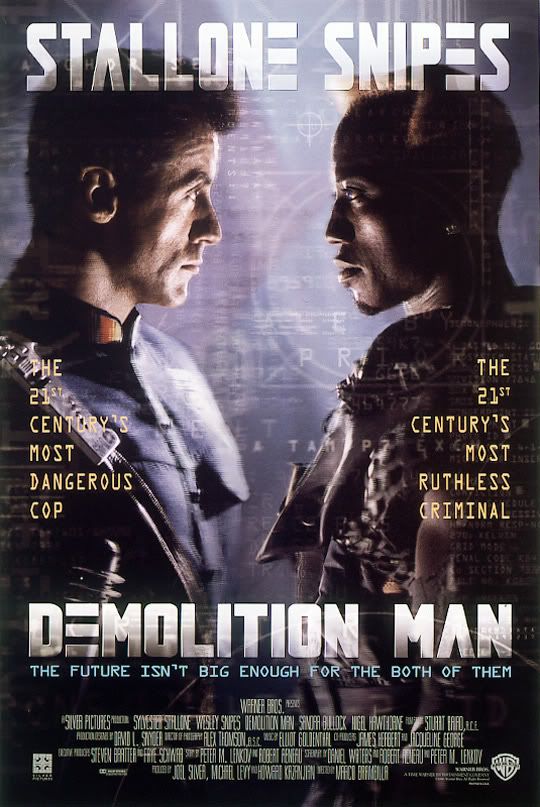
It's hard to imagine someone looking like that convincingly staring down Wesley Snipes!
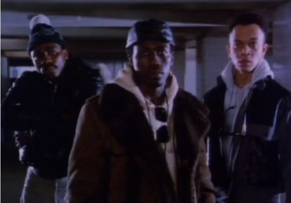
No, you need a tougher image to do that which the actual Bad cover conveys!
MJJMusicFan
Proud Member
I love the cover of BAD as is, thats not to say that I don't like that picture, I very much do in fact, but the fact that the current cover makes a statement and always has is special to me and many others i'm sure.