wendijane
Premium Member
- Joined
- Jan 12, 2008
- Messages
- 25,951
- Points
- 113
see, im thinking the chase commerical now ...he is beautiful in that
see, im thinking the chase commerical now ...he is beautiful in that
1. YesMichael's eyes are so beautiful how could Karen go wrong? Well, you still need awesome skills to do justice to his eyes so total respect!

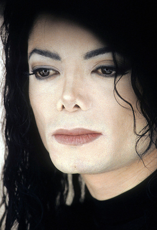
This picture... This is exactly why I started this thread... I'm so glad I did... If he looked at me with those eyes and liner like this, I'd be torn to pieces in a very good way.The eyeshadow. So subtle.

Same.I can't say how I love him
very hard
I just trying breath iinnn oouuttt
rjfherjfhrjkfhrjkfhrjkfhrjkfhrfjjcejklvberkvblrjkvbltjvbljrkvberjkfh;rfh3r;
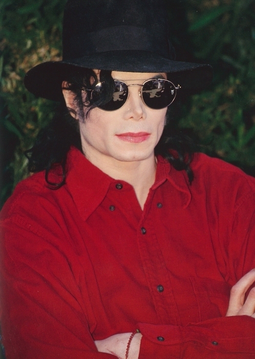
True. I usually don't like red lipstick on men but here it's almost necessary.The red lipstick works here, imo.

I'm glad I did and that we can appreciate and analyse art together.Um, @turtleneck_sweater started this thing less than 3 hours ago and we're already on P.4, lol.
age bloody does make im more and more beautiful i hear ya girls i hear ya ! oh we are spoilt really. yeah , this one can do it allfirst photo just like aaaaaaaaaa
age makes it more and more beautiful
good thinking, wend. I was gonna tag various peeps but got so over-excited I forgot.
this is yes ...i love this make up!!!!!!!!! see that liner! thank you KAREN ! oh i do love this , wont post the commercial cos of c!nt being in it but ......oh when he peeking around that door my my my yes yes yes girls !The eyeshadow. So subtle.

I can hardly hold it together zin really hahagood thinking, wend. I was gonna tag various peeps but got so over-excited I forgot.
I know, babe. But it's the best kind of over-excited, isn't it? It's all good.I can hardly hold it together zin really haha
I wish I was her because she is stunning, too... And his hair... He looks a-ma-zing in a white shirt. Love the commercial. So trippy, like a dream!the whole of that fkung short film advertisement arghhhhhhhhhhhhhhhhh omg now i have to place it here now
this is so dark n sexy and perfect , don't we all live in this short film here? ...are we all not the girl here ????
when i saw this first time - when i was a wee girl i thought .... well..oh fck. so , what else can you do mr ? haha @zinniabooklover @Hiker @turtleneck_sweater @Ana_is_applehead @LinLoveMJ @MacMandy90

Same, girl, same.I can hardly hold it together zin really haha

Amen to that. Earth-Song-goodnessOK, this one for me is more about how his eyebrows have been shaped..His face already is fantastically interesting at all times. But this really shapes his face or, I dunno, the way they have been plucked just brings an extra dimension to his visage. They have a slightly more pronounced arch shape than usual. I assume Karen would have done the eyebrows. Great job.

chase commercial...something about that ... that does me in ... the silhouette and buckles.... does me in , in the man in the mirror book by Todd Gold as well , The chase is the front cover for it . arghhhhhhhhhhhhhhhhhhhhhhhhhhhhhhhhhhhhhhhhhhhhhhhhh oh my dayssee, im thinking the chase commerical now ...he is beautiful in that

Oh the times i wrote i was..I wish I was her because she is stunning, too... And his hair... He looks a-ma-zing in a white shirt. Love the commercial. So trippy, like a dream!
Same, girl, same.
see its that pretty palette again. its like moon-walker in the white coat , coming out his apartment striking, that pretty colour ,Beautiful colour choices for the eyeshadow again.

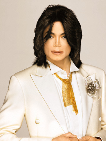
The cover ,the really bright white on the magazine ...i think they could have done for him better too, but this pic is much much much better than the actual cover because it is cream he is wearing its not that stark white. he never wore stark white at all. I do like the gold jacket pose inside the magazine , but ... he looks younger all in that though, yeah that is an issue for me lol -he has the pretty make up here but it's not really rock star is it. its not daddy. L'uomo L'uomo L'uomo !These photos look a little too airbrushed for my liking but it's still a beautiful make-up job and he looks gorgeous, as ever.

This is just absolutely breath takingI know I already posted one very similar to this but I'm so taken by the eyeliner, this time being shaded all the way to the corner. And with that smoky feel to it. Lovely colour choice on the eyeliner, above and below.

I think HIStory has two looks, one with no eye makeup. I think I have seen that performance. I will try to find it.His eyeliner here is slightly harsh - just a tiny bit - but I still love it.

I live in here yes. my god, beyond words...the whole of that fkung short film advertisement arghhhhhhhhhhhhhhhhh omg now i have to place it here now
this is so dark n sexy and perfect , don't we all live in this short film here? ...are we all not the girl here ????
when i saw this first time - when i was a wee girl i thought .... well..oh fck. so , what else can you do mr ? haha @zinniabooklover @Hiker @turtleneck_sweater @Ana_is_applehead @LinLoveMJ @MacMandy90

