Latest on MJJC
- Latest Michael Jackson News
- Click Here to Join Our Community
- Follow us on X
- Wanna talk Michael? Come join the chat rooms
- The Michael Jackson Chart Watch
- Become an MJJC Patron
- Join the Premium Member Group and Get Lot's of Extra's
- Major Love Prayer - Worldwide Monthly Prayer Every 25th
- MJJC Exclusive Q&A - We talk to the family and those in and around Michael
- Join us in the Chat Rooms
- Find us on Facebook
You are using an out of date browser. It may not display this or other websites correctly.
You should upgrade or use an alternative browser.
You should upgrade or use an alternative browser.
Best album cover
- Thread starter Doggone
- Start date
Prince Of Pop
Proud Member
- Joined
- Jul 25, 2011
- Messages
- 3,325
- Points
- 83
No contest....Dangerous
barbee0715
Proud Member
Has to be Dangerous.
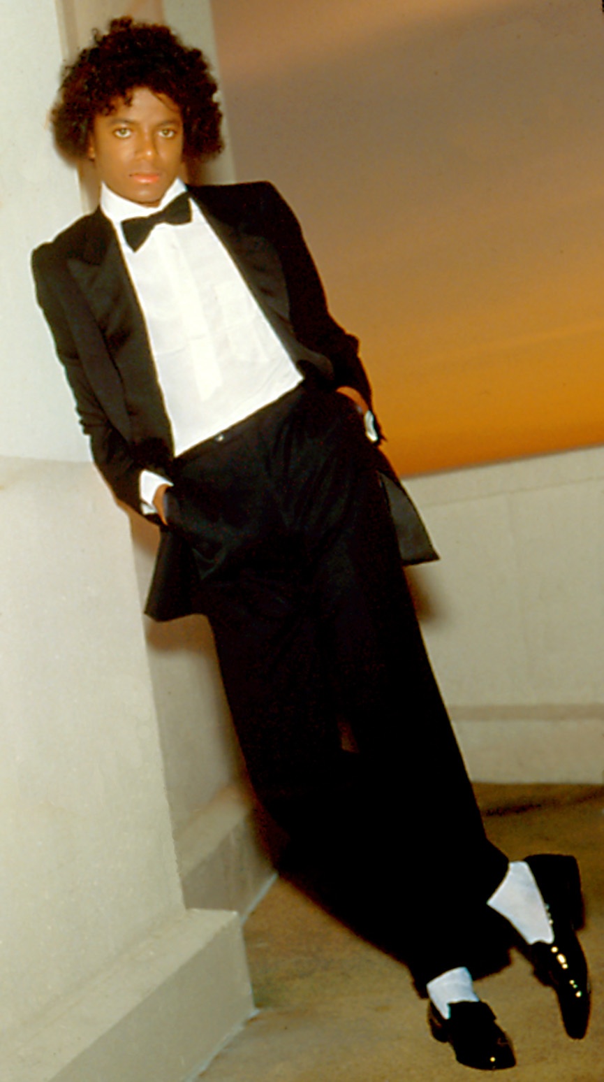
2-Off the Wall glorious happiness
3-BAD-sex on legs wrapped in black leather.
(poll lets you vote more than once? I know it says multiple choice but wanted to make sure I didn't cheat.)
2-Off the Wall glorious happiness
3-BAD-sex on legs wrapped in black leather.
(poll lets you vote more than once? I know it says multiple choice but wanted to make sure I didn't cheat.)
Last edited:
Bringing Brighter Days
Proud Member
- Joined
- Jan 20, 2015
- Messages
- 631
- Points
- 0
OTW was the only album cover where Michael's smiled
mjprince1976
Proud Member
The cover to Michael is incredible, I really love it and if I ever buy a Mansion, I want it blown up and painted on the ceiling. It will be the MJ Tribute ceiling. Even better than that is the unused version which had the Prince symbol floating in a fish tank.
Very close second is Dangerous, I love the complexity of that design and the music on that album is much better than Michael, but come on the cover to Michael is very cool.
Very close second is Dangerous, I love the complexity of that design and the music on that album is much better than Michael, but come on the cover to Michael is very cool.
Psychoniff
Proud Member
- Joined
- Apr 14, 2015
- Messages
- 933
- Points
- 0
Off The Wall - Classic period, MJ looks happy and the tux and Afro give it that simply but classic look.
Dangerous - Dearing, mysterious, ambitious, adventurous.
Michael - Similar to Dangerous in scope and the definite made for poster artwork.
Dangerous - Dearing, mysterious, ambitious, adventurous.
Michael - Similar to Dangerous in scope and the definite made for poster artwork.
Psychoniff;4099577 said:Off The Wall - Classic period, MJ looks happy and the tux and Afro give it that simply but classic look.
Dangerous - Dearing, mysterious, ambitious, adventurous.
Michael - Similar to Dangerous in scope and the definite made for poster artwork.
The ‘Dangerous’ cover is mysterious because MJ wanted people to interpret the images for themselves.
The ‘Michael’ cover is a totally unsuccessful effort to recapture the impact/appeal of the ‘Dangerous’ cover.
HIStoric
Proud Member
- Joined
- Apr 12, 2011
- Messages
- 3,456
- Points
- 48
mj_frenzy;4099602 said:The ‘Michael’ cover is a totally unsuccessful effort to recapture the impact/appeal of the ‘Dangerous’ cover.
I never really got it as an attempt to redo Dangerous, more so just show MJ's career overtime in one image. It was the best part of the album for me, I even have it up as a poster in my room. It's better when the sides aren't cut off for the 1:1 album artwork
Snow White luvs Peter Pan
Proud Member
Dangerous, no other is even close.
If Mr. Brainwash artwork had been the actual Xscape cover, it'd be in my top 3 of favorites, Bad and Thriller are tied in no. 2. And if this picture with the same brick wall background had been the OTW cover, it'd be in my top 5. I love everything in Michael in this picture.


If Mr. Brainwash artwork had been the actual Xscape cover, it'd be in my top 3 of favorites, Bad and Thriller are tied in no. 2. And if this picture with the same brick wall background had been the OTW cover, it'd be in my top 5. I love everything in Michael in this picture.


Dangerous, no other is even close.

Wow! And extra wow! This is just sublime. I wish I was still young enough to have pictures up in my bedroom!!
Snow White luvs Peter Pan
Proud Member
^I don't think having a few pictures would make you seem juvenile.
barbee0715
Proud Member
^^Alec Baldwin and his wife have a framed studio shot photo of Michael on their LR wall. You're never too old!!
Antwort
Proud Member
- Joined
- May 22, 2014
- Messages
- 1,303
- Points
- 63
*tries very hard not to burst out laughin' whilst lookin' @ the hair* :girl_whistle:

..............and fails miserably :girl_haha:

This on the other hand is no jokin' matter; quite serious too, all blinged out and iced out with his little ring on.....makes ya wanna get up, do the military salute and say "yes, ssssir; of course, sir"
And since photos seem to be the rage of the moment, might as well take a sec and appreciate this one posted on the MJJC FB wall

Talk about needin' a whole fire department :cheeky:
What was the thread about again? Oh, yeah.....favorite album covers - Dangerous of course, no brainer there.

..............and fails miserably :girl_haha:

This on the other hand is no jokin' matter; quite serious too, all blinged out and iced out with his little ring on.....makes ya wanna get up, do the military salute and say "yes, ssssir; of course, sir"
And since photos seem to be the rage of the moment, might as well take a sec and appreciate this one posted on the MJJC FB wall

Talk about needin' a whole fire department :cheeky:
What was the thread about again? Oh, yeah.....favorite album covers - Dangerous of course, no brainer there.
Last edited:
Psychoniff
Proud Member
- Joined
- Apr 14, 2015
- Messages
- 933
- Points
- 0
mj_frenzy;4099602 said:The ‘Dangerous’ cover is mysterious because MJ wanted people to interpret the images for themselves.
The ‘Michael’ cover is a totally unsuccessful effort to recapture the impact/appeal of the ‘Dangerous’ cover.
Why was it "unsuccessful'? Please elaborate.
Bringing Brighter Days
Proud Member
- Joined
- Jan 20, 2015
- Messages
- 631
- Points
- 0
The Dangerous cover features the main promo shot of MJ when Bad was released
innuendo141
Proud Member
Dangerous - however I gotta give a shout out to BOTDF..... thats just a great great cover
Lisha
Proud Member
- Joined
- Aug 22, 2007
- Messages
- 5,943
- Points
- 83
The Dangerous cover features the main promo shot of MJ when Bad was released
Interesting. Why do you think MJ chose to have that included on the Dangerous cover?
and...
His hair here looks a little like my son's right now. All those curls! So hard to tame. :lol:
SmoothCriminal1995
Proud Member
- Joined
- Apr 28, 2012
- Messages
- 3,206
- Points
- 113
Tough question :scratch:
Dangerous represents the themes within the album the best, it's so mysterious and intriguing
I love BAD it's just cool MJ in leathers looking tough was very iconic
Dangerous represents the themes within the album the best, it's so mysterious and intriguing
I love BAD it's just cool MJ in leathers looking tough was very iconic
Doggone
Proud Member
- Joined
- Dec 16, 2013
- Messages
- 1,203
- Points
- 38
Mike looks good on the Bad cover. The way he just looks at ya. So serious, so tough. The clothing he's wearing. So simple, yet so perfect.
But Dangerous album... Damn. His eyes. His eyebrows. And all the mysterious characters around it. The other album covers feature a whole face of body of Mike. But on Dangerous. It's just his eyes, which makes it very mysterious but yet so beautiful. I swear the album cover just represents all the songs on the album. Love it. No other album comes near to the perfection of the Dangerous album cover.
But Dangerous album... Damn. His eyes. His eyebrows. And all the mysterious characters around it. The other album covers feature a whole face of body of Mike. But on Dangerous. It's just his eyes, which makes it very mysterious but yet so beautiful. I swear the album cover just represents all the songs on the album. Love it. No other album comes near to the perfection of the Dangerous album cover.
AstralRomance
Proud Member
- Joined
- Jul 18, 2015
- Messages
- 19
- Points
- 0
I'd agree about Dangerous. But i also like Blood on the Dance Floor and Xscape!
I like the idea of Xscape cover... the whole Universe fits into Michael
I like the idea of Xscape cover... the whole Universe fits into Michael
SheilaMJFan4Ever
Proud Member
It's Off The Wall for me! The tux, the FRO, his SMILE and how it seemed he was going to dance his way off the cover, lol! I used to keep the vinyl inside the inner sleeve (when I wasn't playing it) as I displayed the full folded out album cover on my wall. :girl_love:
Last edited:
MJsBollywoodGirl7
Proud Member
It is definitely the Dangerous album. I remember finding things on that cover. That I have never notice before. This was years after first getting the album back in 1993. It is one of the reasons why that album has remain my number 1 favorite MJ album. Another reason it is because of Who Is It being on that album.
DanGerouS-
2000 Watts $horty
- Joined
- Aug 22, 2013
- Messages
- 1,145
- Points
- 113
i like dangerous the most.
but i love the Xscape cover. why?
cause they didnt use an outdated/old image of MJ and it could have been used as a cover of a new album between 2004-2009.
(i dont care if its photoshopped, since thats normal nowadays)
but i love the Xscape cover. why?
cause they didnt use an outdated/old image of MJ and it could have been used as a cover of a new album between 2004-2009.
(i dont care if its photoshopped, since thats normal nowadays)
HIStoric
Proud Member
- Joined
- Apr 12, 2011
- Messages
- 3,456
- Points
- 48
Snow White luvs Peter Pan
Proud Member
To each their own on tastes but in all honestly, Michael looks like he has a dog's cone of shame to prevent to lick himself, his lips were hideously photoshopped and because of the Xscape font it looks like he has Martian antennae. Mr. Brainwash artwork looks more realistic and human even though it kind of reminds me to the Uncle Sam poster with the 'I WANT YOU' slogan but Michael looks so hot.
barbee0715
Proud Member
Oh yes. Totally agree. Absolutely hideous cover. If we had a worst album cover thread, I'd give it a 100 votes.To each their own on tastes but in all honestly, Michael looks like he has a dog's cone of shame to prevent to lick himself, his lips were hideously photoshopped and because of the Xscape font it looks like he has Martian antennae. Mr. Brainwash artwork looks more realistic and human even though it kind of reminds me to the Uncle Sam poster with the 'I WANT YOU' slogan but Michael looks so hot.
It made it even worse when we got the Mr. Brainwash artwork. That would have been a perfect cover.
