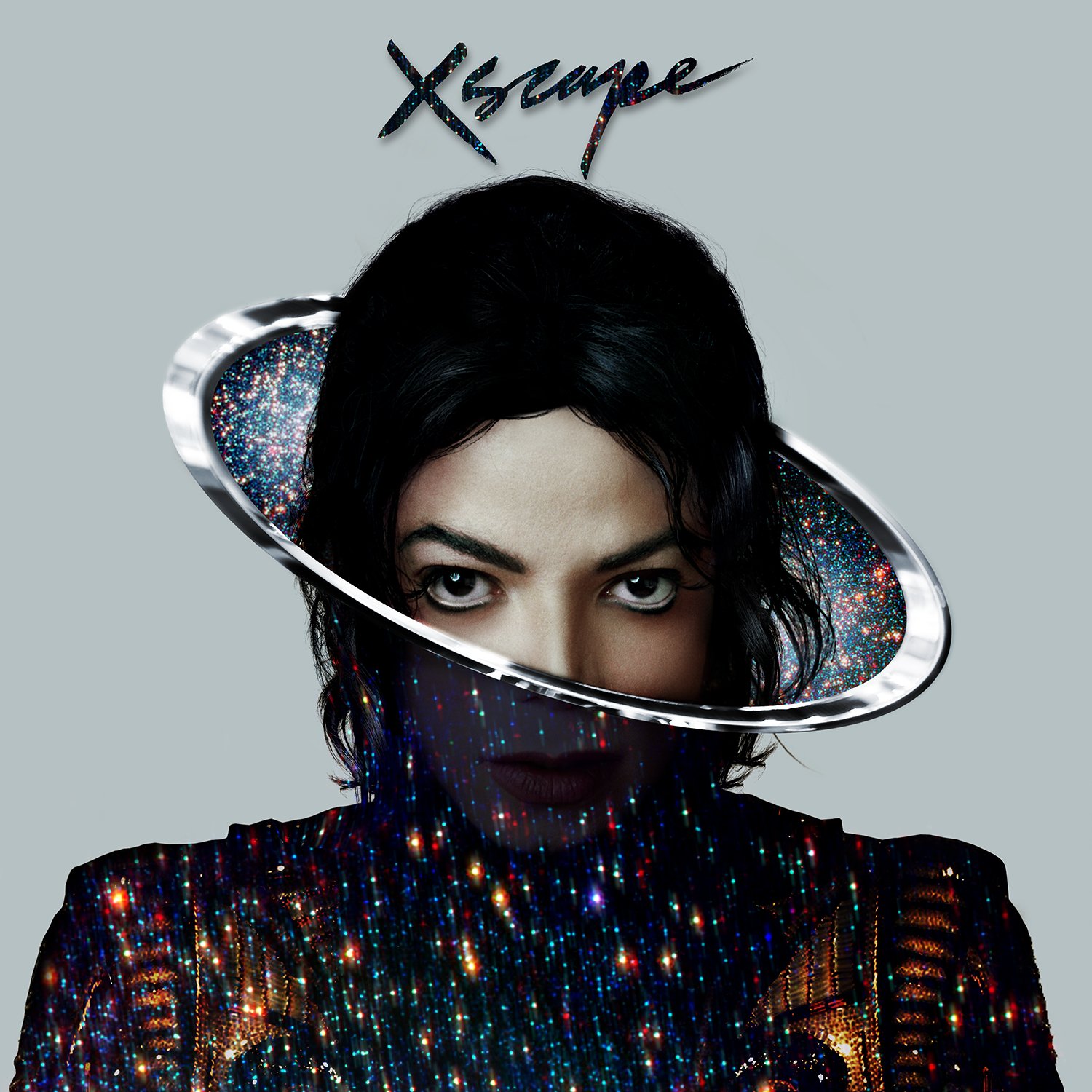
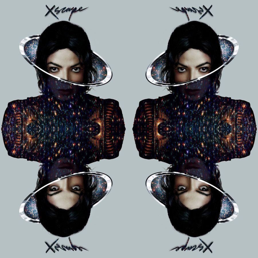
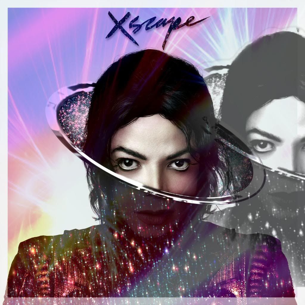
The Beauty of The Xscape Cover Art ( Pictures. Wall Paper, Banner, Video Art )

wendijane

Premium Member
Joined
Jan 12, 2008
Messages
25,832
Points
113
Please add all Discussion of Your favourite Official Visual images here. Plus your creative Original Pictures/ Videos/First Impressions/ Any and All Art Expression/ Art Discussion & Show How MUCH we have learnt from Michael and all of his Artistry in This Thread.


As a Very,Very Very, high percentage of us know, Michael's New Album *Xscape* not only promises to be something of amazing.... It truly offers the HIGHEST standard of Creative Flair and Stylish Cover Art to date.

I, like many others Truly and honestly believe The artistic " Portrait " is a project Michael would have possibly enjoyed and would had possibly been very proud of , as It is without a doubt, Pure Art. ........Escapism !


So, Let's Simmer,celebrate, Talk, Create,
Bright-animated-star-shining-at-night-gif.gif

Let's be Inspired by Michael's Beautiful album cover and the art work that is Xscape.
Bright-animated-star-shining-at-night-gif.gif

Remember, When considering art, Don't think about it, Become it and Just Flow.
Bright-animated-star-shining-at-night-gif.gif


~"They want wonderful experiences. We want to take them places that they’ve Never been before. "~
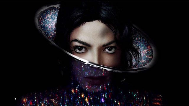

xscape-video-trailer.jpg


The Sky is truly The limit with Our Beautiful and Ever- Inspiring Michael and His Eternal Loving MJFam.
 
Last edited:
Re: The Beauty of The Xscape Cover Art ( Pictures. Wall Paper and Banner art )

I found these in Facebook, I think they are the best to promote!

1939867_623097031102936_376189808_o.jpg

859548_623097034436269_740983603_o.jpg

857630_623097037769602_493346240_o.jpg

1888765_623097027769603_1214725200_o.jpg

1486061_623097024436270_174869642_o.jpg

10003840_623097021102937_790162152_o.jpg
 
Re: The Beauty of The Xscape Cover Art ( Pictures. Wall Paper and Banner art )

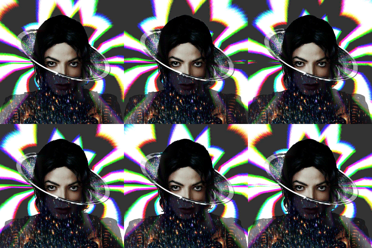
I hope this fits in here. I made my own version of the two covers, feel free to use them to promote the album:
I improved the details+ lightning a bit, made the colors in the word "Xscape" a bit more like in the "round thing", incorporated the "MJ" Logo from the Xscape-Trailer instead of lips and added the "Michael Jackson" letters.
In reminds me of "Space Michael meets Ninja / Mortal combat character now" ;-)


Re: The Beauty of The Xscape Cover Art ( Pictures. Wall Paper and Banner art )

Big image - Right click - Open Image for full res.
81CDIT-ruFL._SL1500_.jpg
 
Re: The Beauty of The Xscape Cover Art ( Pictures, Wall Paper and Banner art )

The official USA homepage should change like the Russian Michael Jackson site did, this is what should happen.

http://www.michael-jackson.ru/
 
Re: The Beauty of The Xscape Cover Art ( Pictures, Wall Paper and Banner art )

The official USA homepage should change like the Russian Michael Jackson site did, this is what should happen. As well as worldwide tv commercials, billboards.. etc.

http://www.michael-jackson.ru/

wow, that's great. But that's not the official MJ Russia site, is it?
 
Re: The Beauty of The Xscape Cover Art ( Pictures, Wall Paper and Banner art )

Who is the member who made the IPhone covers/wallpaper ? Can we get that in here too please? :heart:
 
Last edited:
I found this from someones twitter, but I'm not sure whether this person wants his/her twitter name here so I just copied the photo. I thought this is so cool

BkKX2aFCcAAALK-.jpg
 
I found this from someones twitter, but I'm not sure whether this person wants his/her twitter name here so I just copied the photo. I thought this is so cool

BkKX2aFCcAAALK-.jpg


Like this one. I am looking for a good one to put on my desktop anybody have one?
 
PNG Sources for graphic art

So I made those to help people out with graphic arts... If you use them please credit me if it's not too much to ask :)

Michael-Jackson-Xscape_zps1a9b2ce1.png


Xscape_Logo_zpsc47f1ed0.png
 
These are all so great! Thank you for sharing because I have no idea how to do stuff like this.
 
the cover looks great! is that a real MJ photo? if yes, from what year is it?
 
Does anyone know the original picture that was used for the cover? I particularly like the cover. It looks futuristic. Not cheap, as some ppl think it is.
 
"It was really important to everyone (including myself) that the cover felt like a new Michael album, something he might have done today, rather than a retrospective image that may have looked like a best of. I really wanted to capture the magic and power of MJ but also his vulnerability."

That made me believe he's a fan.
 
I love what Mat Maitland says about this picture that he created, and what he was trying to portray. What do you guys think??

"Michael is all around us, in our universe and beyond, on earth and in outer space."
 
Great little interview, thanks for posting it.

"I wanted to evoke a contemporary and quintessential incarnation of Michael as an artist who constantly injected new blood into his music and also to focus on both the intriguing and futuristic aspects of MJ. As well as being a tribute, I hope that it will inspire reflection on a man who continues to stimulate and offer unique creative musical possibilities to so many today. I also tried to say that Michael is all around us, in our universe and beyond, on earth and in outer space."

I think he did that with his cover.
 
Does anyone have any small to medium forum banners and avatars to use on other forums?

Thank.
 
...Anybody notice that on the deluxe edition cover art Michael's hair is longer? It looks like his hairstyle in This Is It.
Is that official or a fan edit?

I guess that's the deluxe version of Michael's hair. You pay more, you get more hair.
 
Back
Top